Crafting the ritual
of calm
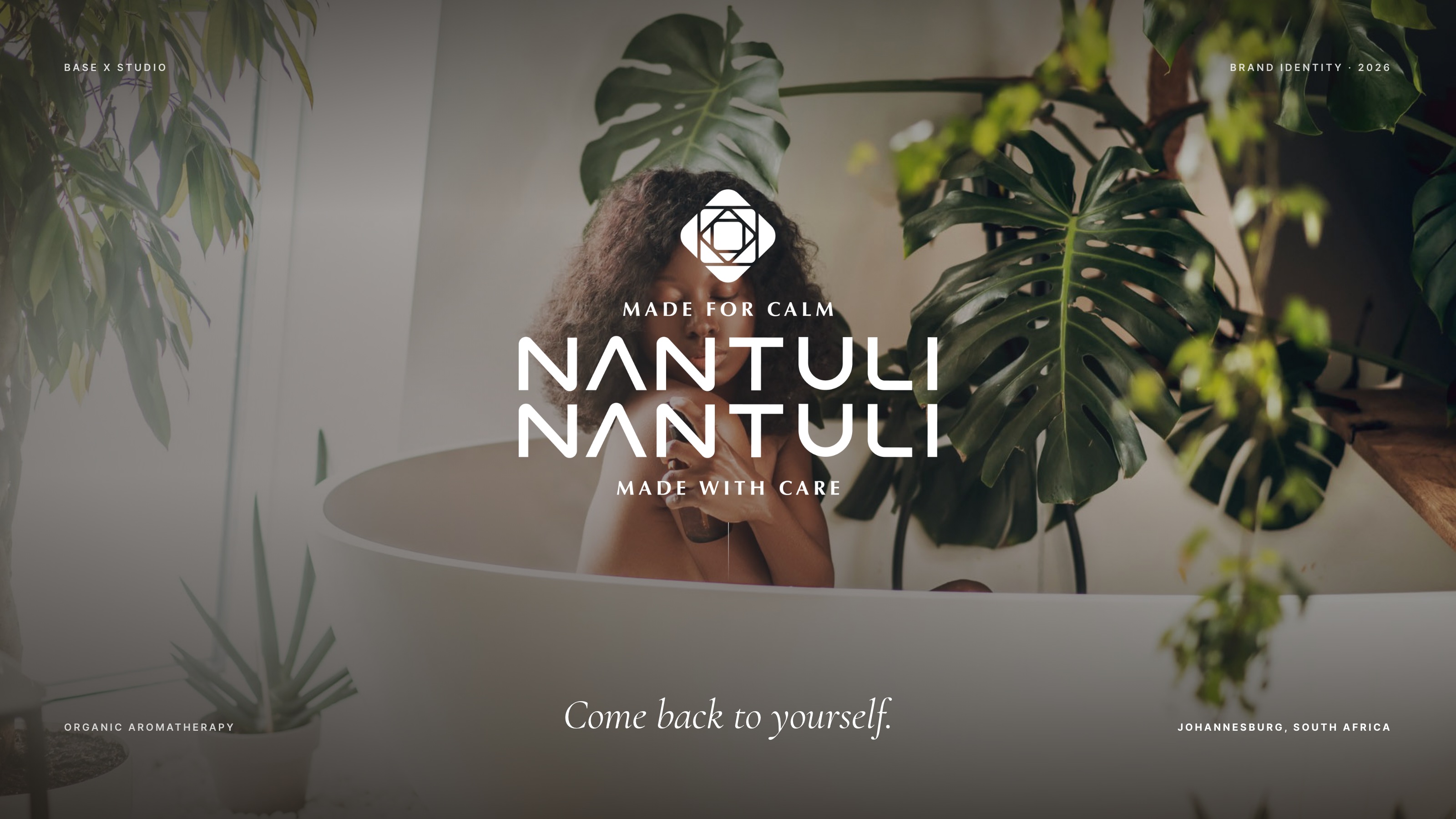
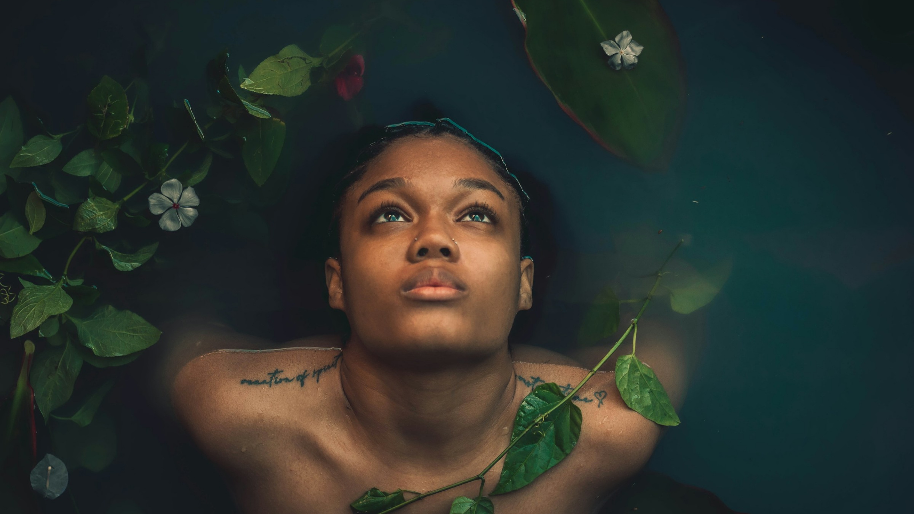
With this project, we had to turn two generations of pain and the inherited rituals of relief and care into a brand. Bringing the transferred wisdom and the intentional embrace of rest and calm to the individuals who need it the most.
The brief
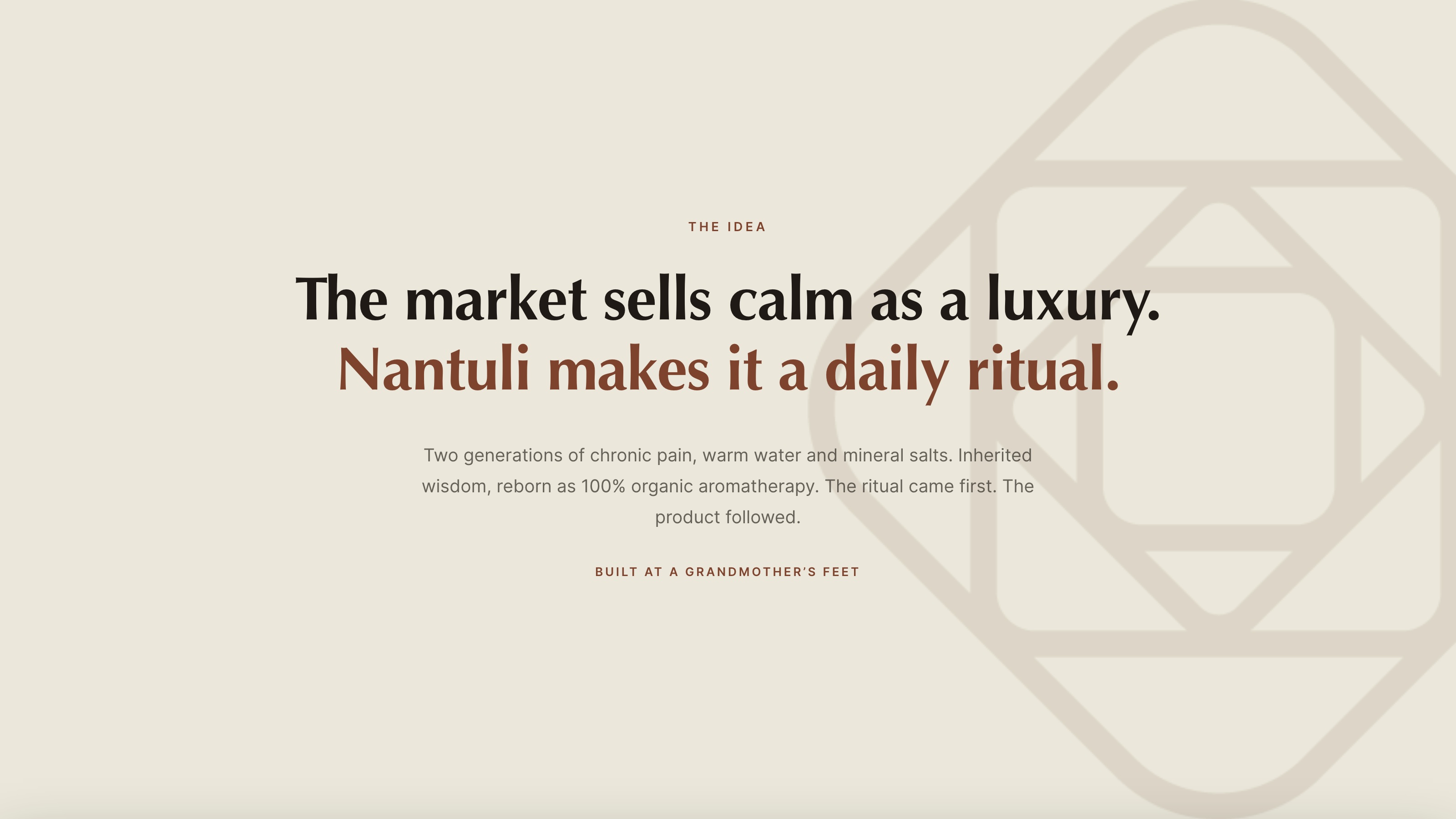
Thuli had the product long before she had a brand around it. Two generations of chronic pain in her family, a grandmother’s practice of warm water and mineral salts, and eventually three blends of her own, each 100% organic and named in isiZulu for what it does.
What she did not have was a way to say any of that to a stranger. The ritual was real and the market was real, and none of it was legible from outside the family. A founder in that position does not have a brand problem to fix. She has a brand that has not been built yet.

The plan
The brief was the whole brand, in sequence, and the sequence mattered more here than in any rebrand. Thuli did the clarity work herself on the BOS Platform: category, position, audience, point of view, voice, set down in her own words before a single mark was drawn.
We built the identity on top of what came out of it. Diagnosis before direction, strategy before expression, because a wellness brand with nothing underneath it is trend-dependent inside a year.
The work
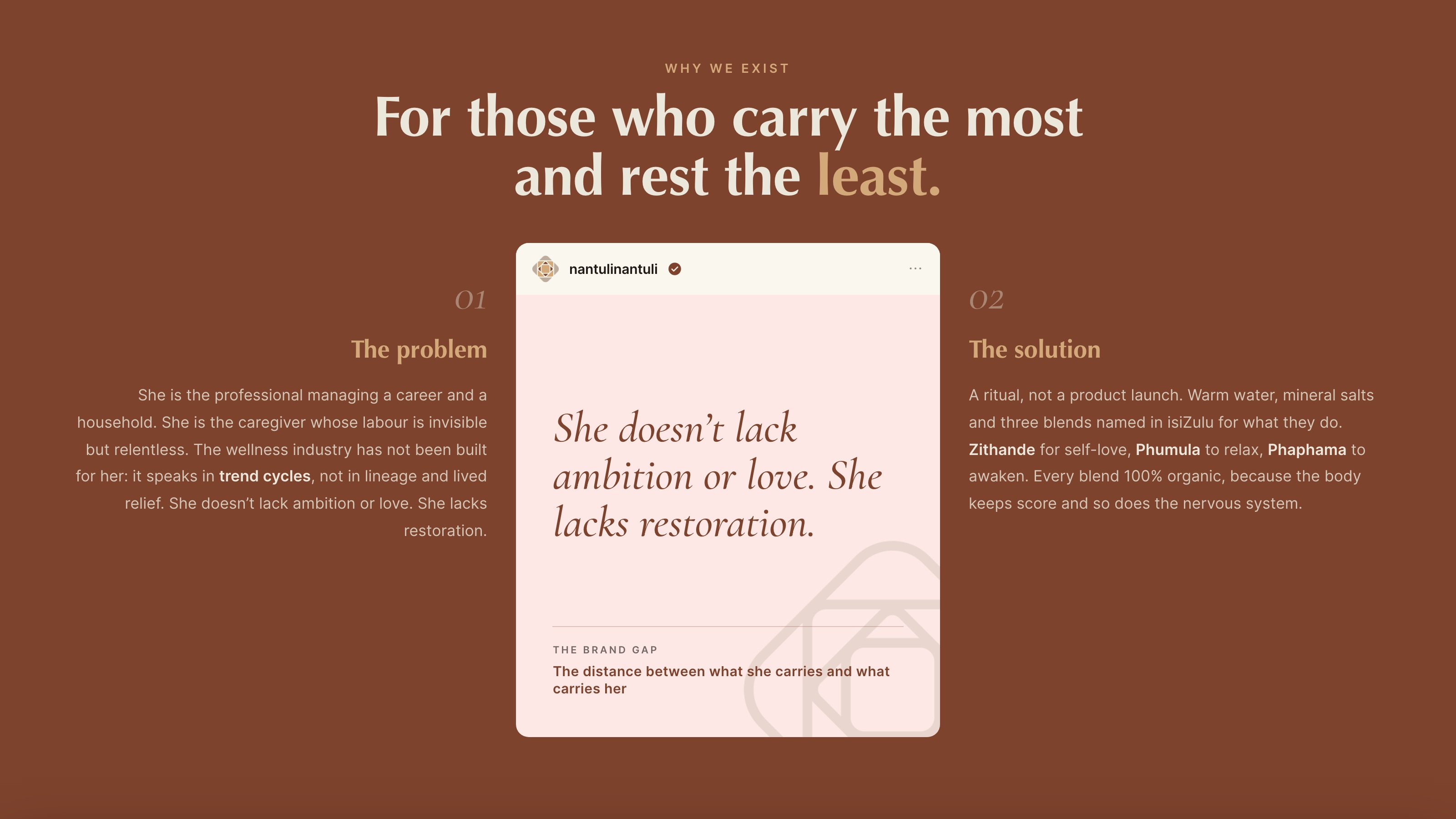
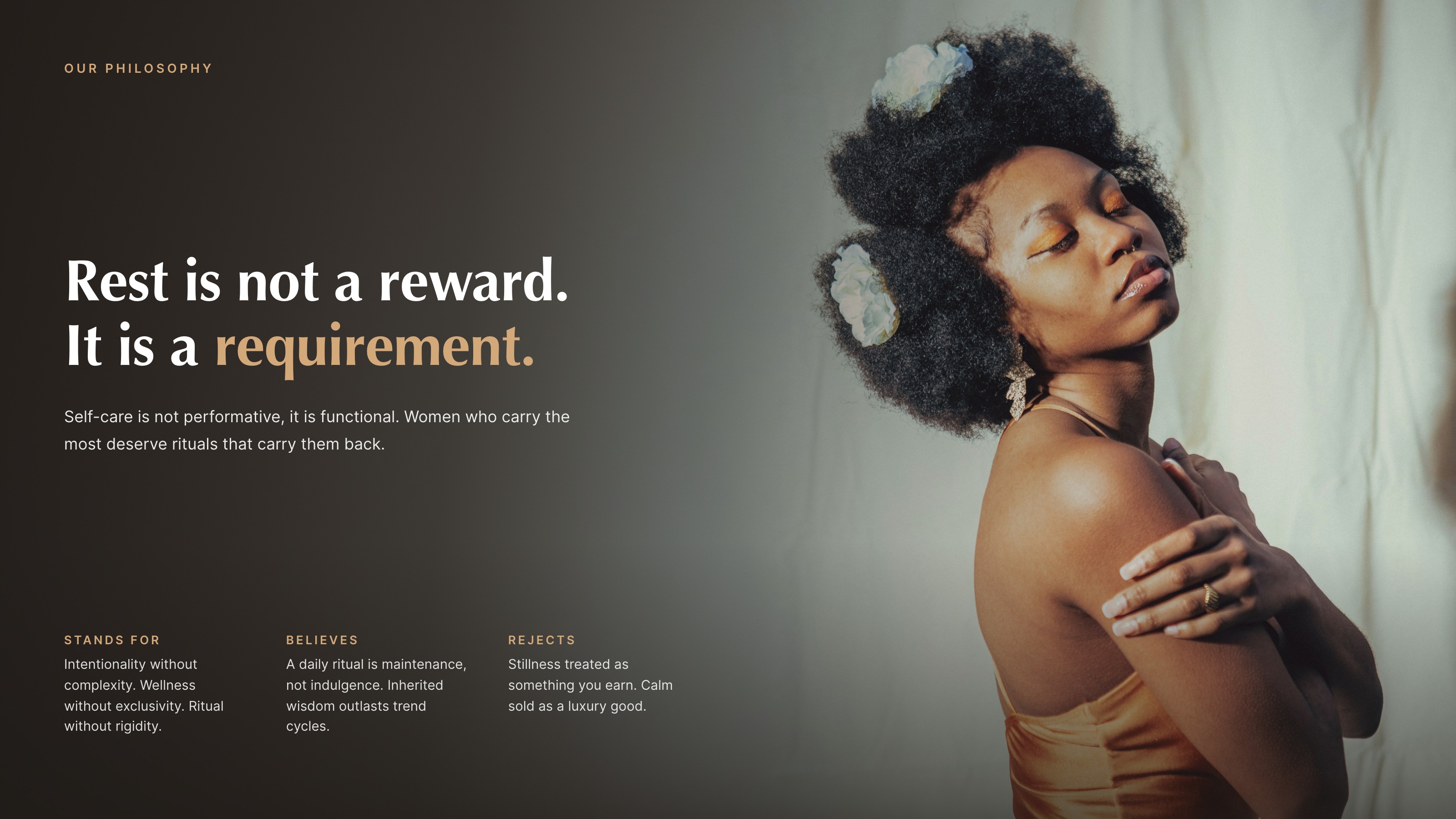
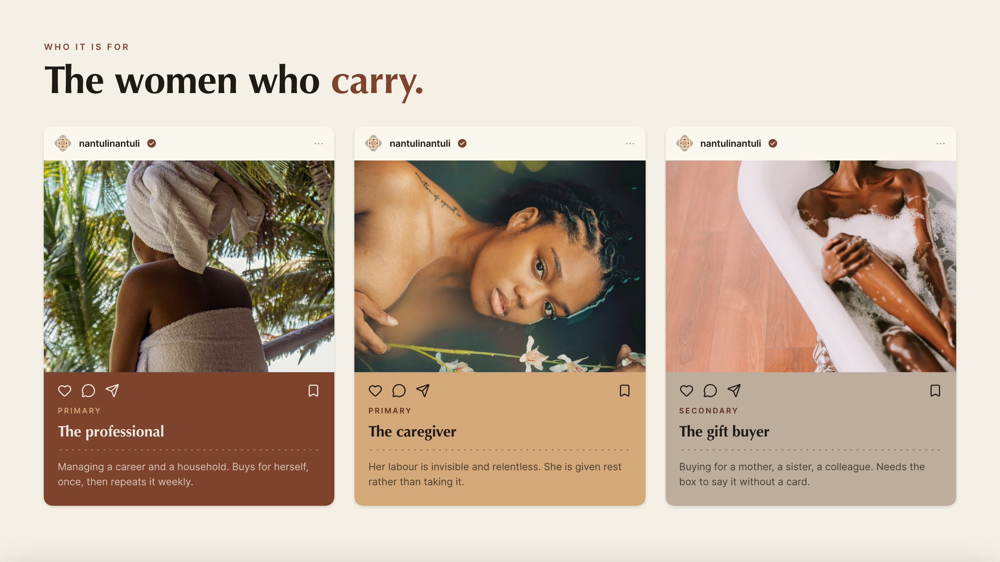
The platform gave us the spine. Rest is not a reward, it is a requirement. The customer is the woman who carries the most and rests the least. The category is not indulgence, it is maintenance. Everything visual had to hold that or it was wrong, however pretty it looked.
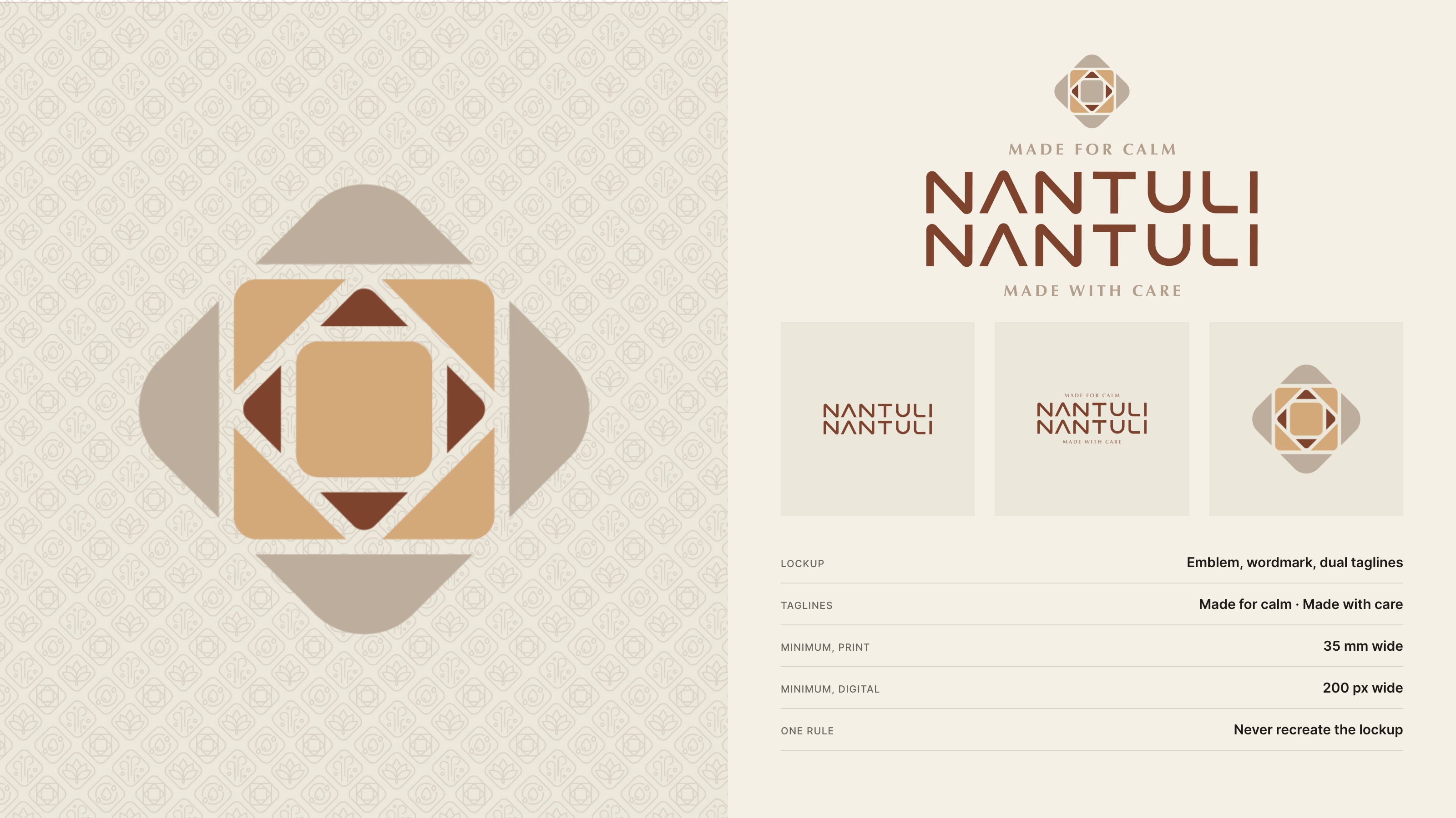
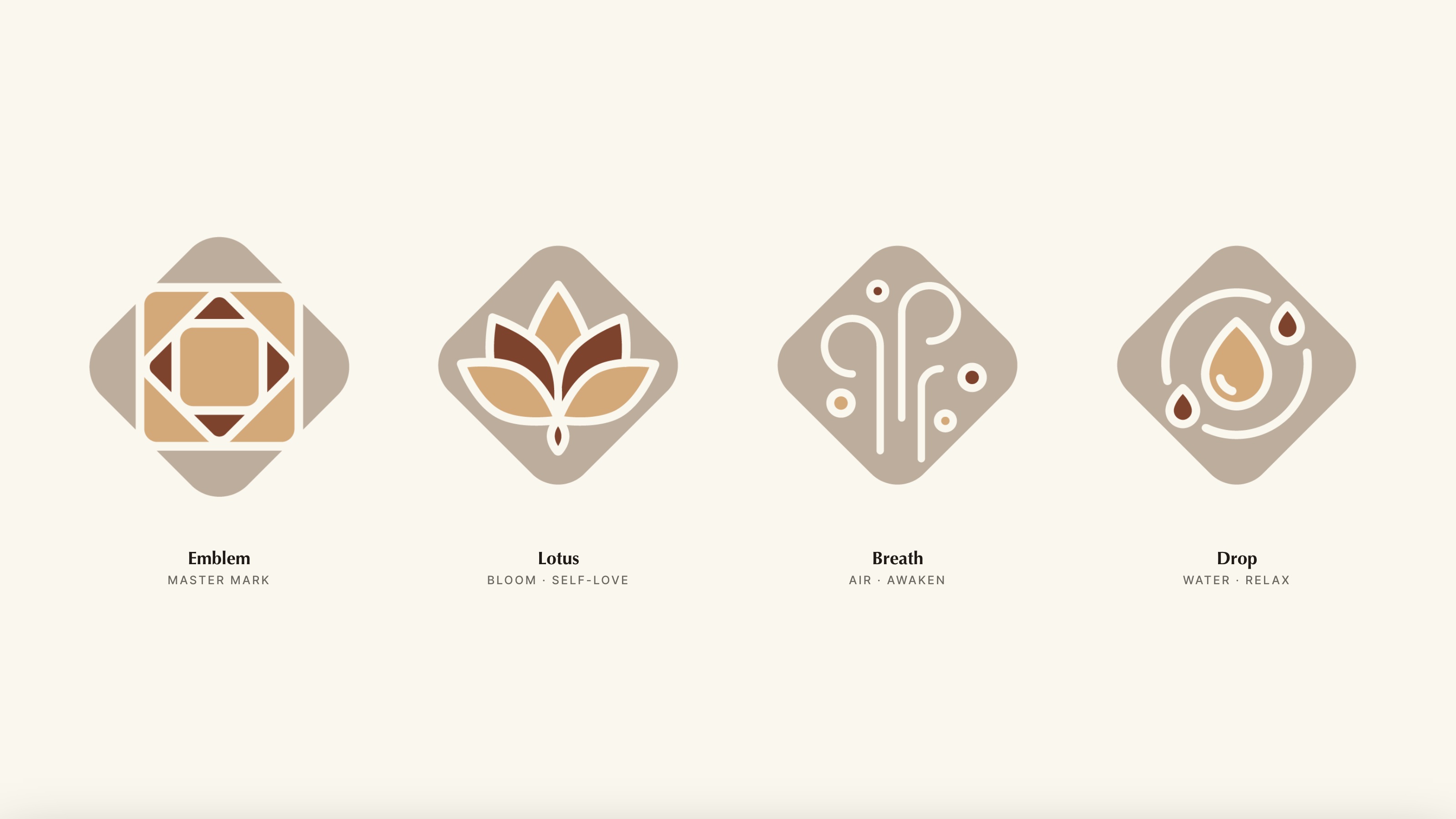
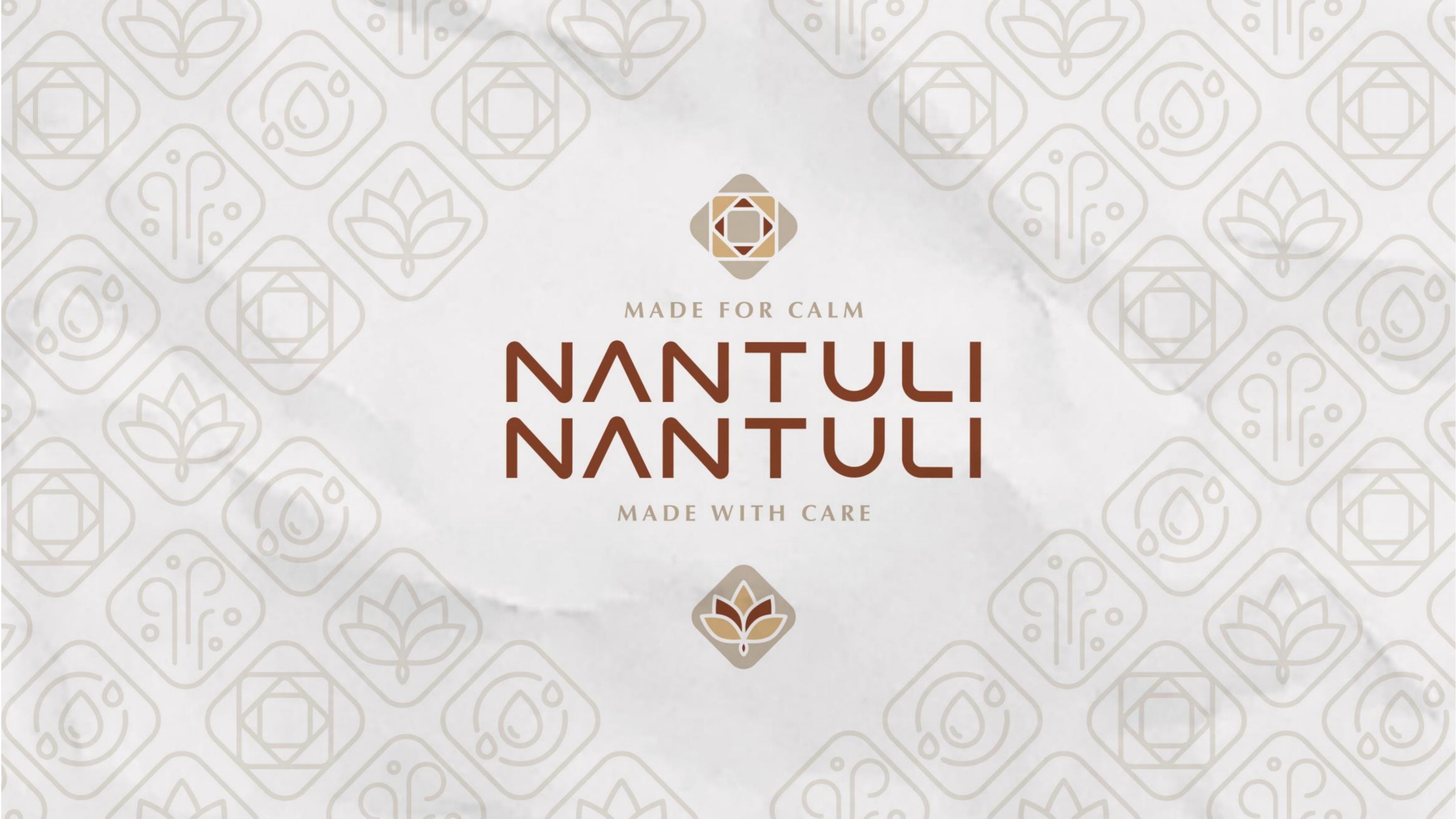
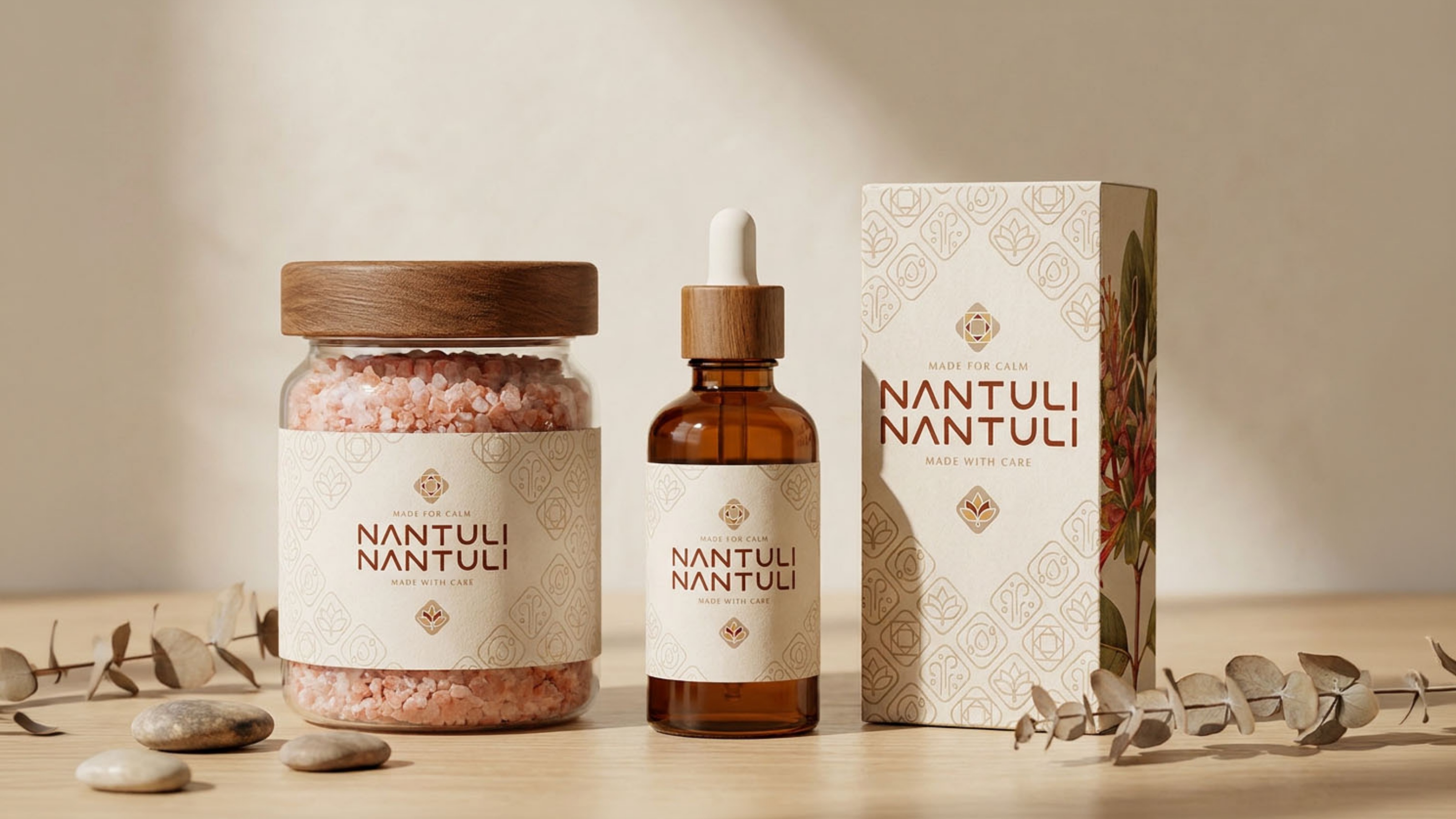
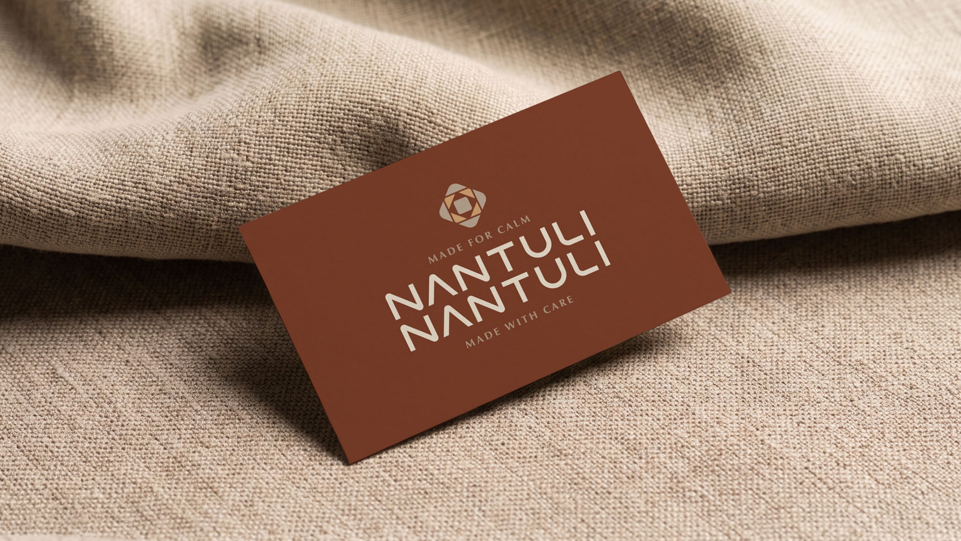
The mark came out of the ritual rather than the category. It is four rounded squares, each turned against the last, and what they build reads as a faceted crystal. The four points are the four elements the blends are actually made of: air, water, botanicals, crystal. So the emblem describes the product rather than decorating it, and the lattice that runs through the packaging is the same figure repeated.
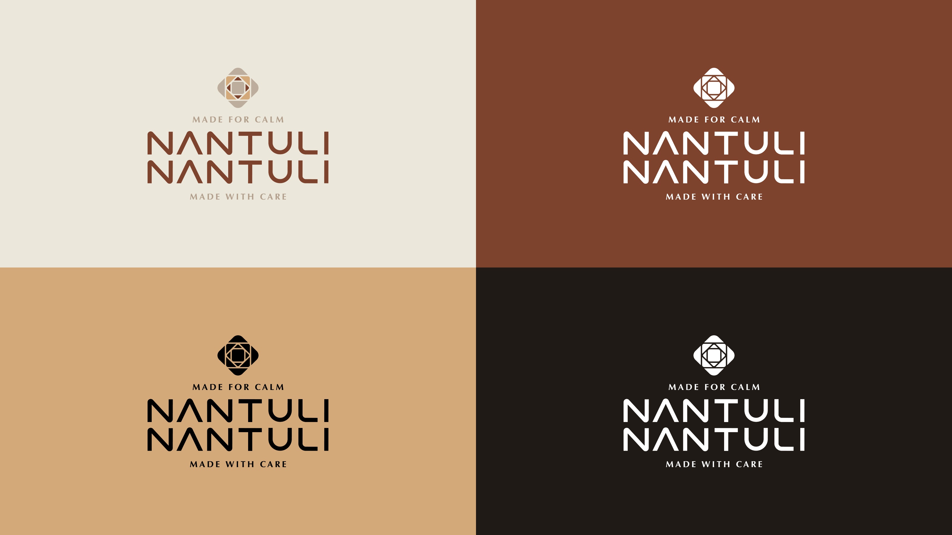
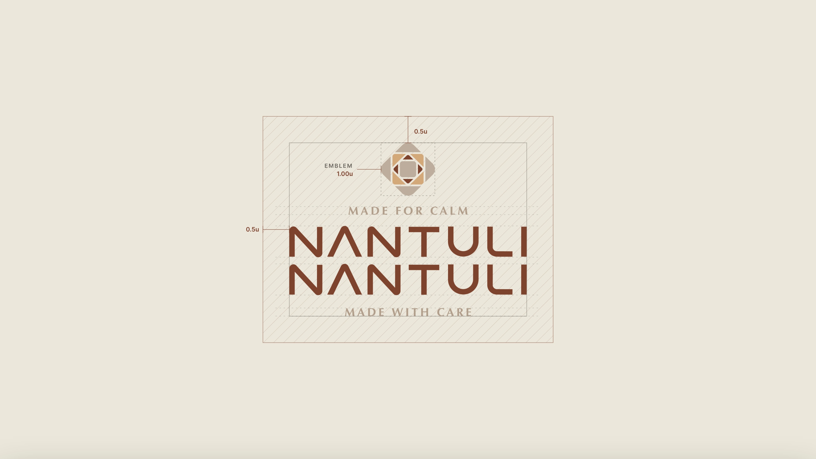
Three signature elements extend the family inside that same field: a lotus for self-love, a breath for awakening, a drop for rest. One construction throughout, so the set always reads as one hand. The wordmark sits on two lines under the emblem with a tagline above and below it.
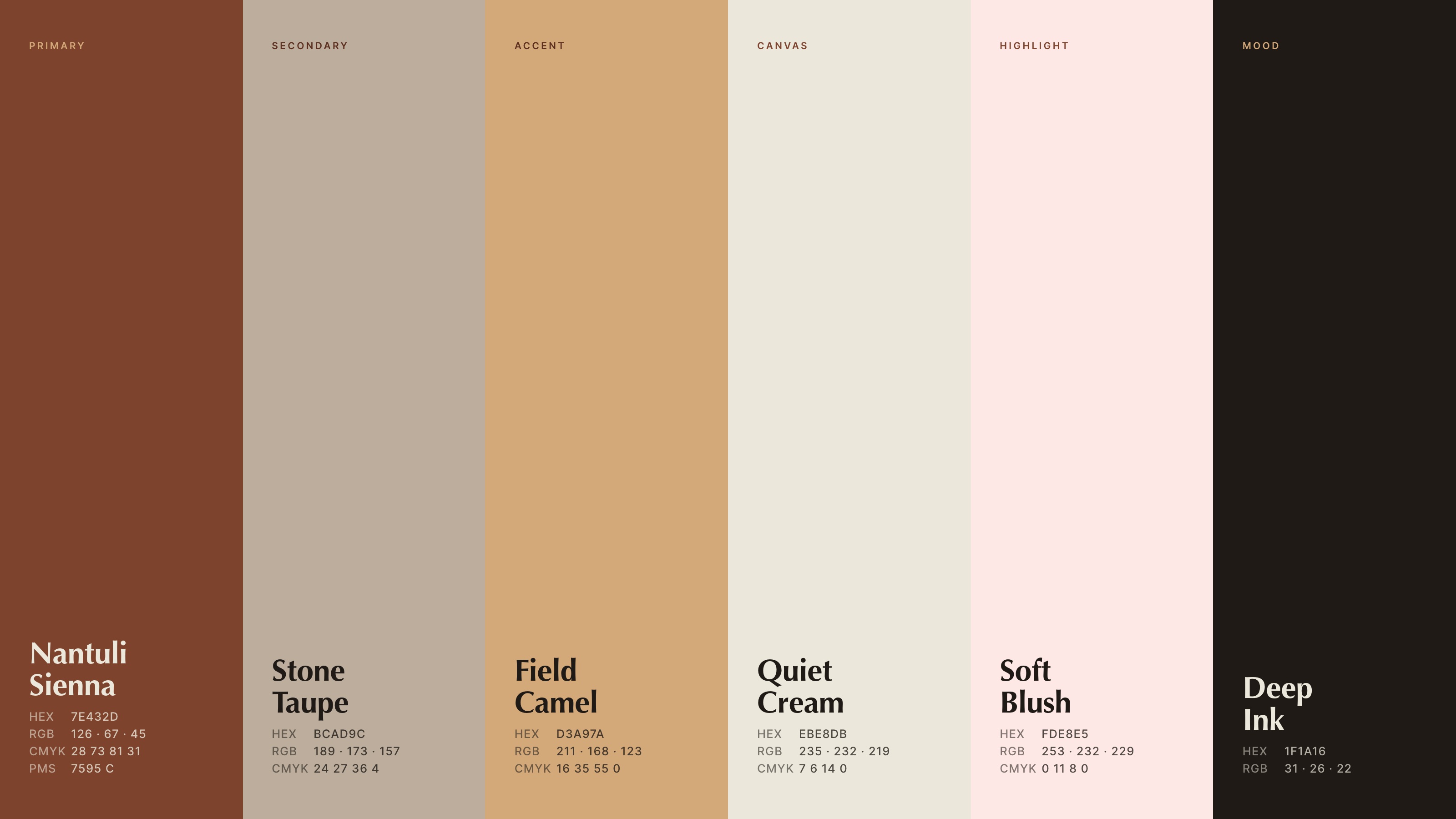
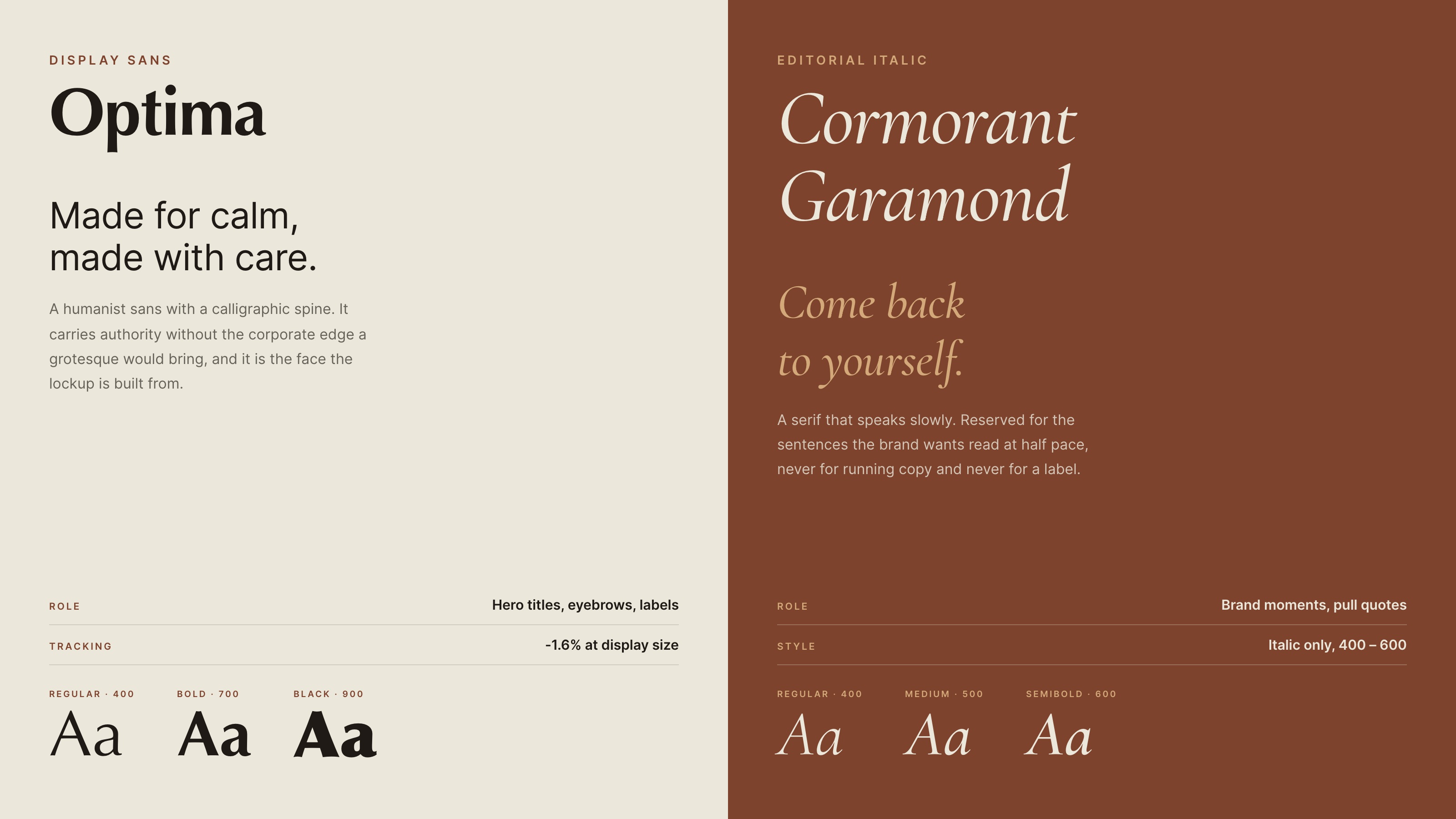
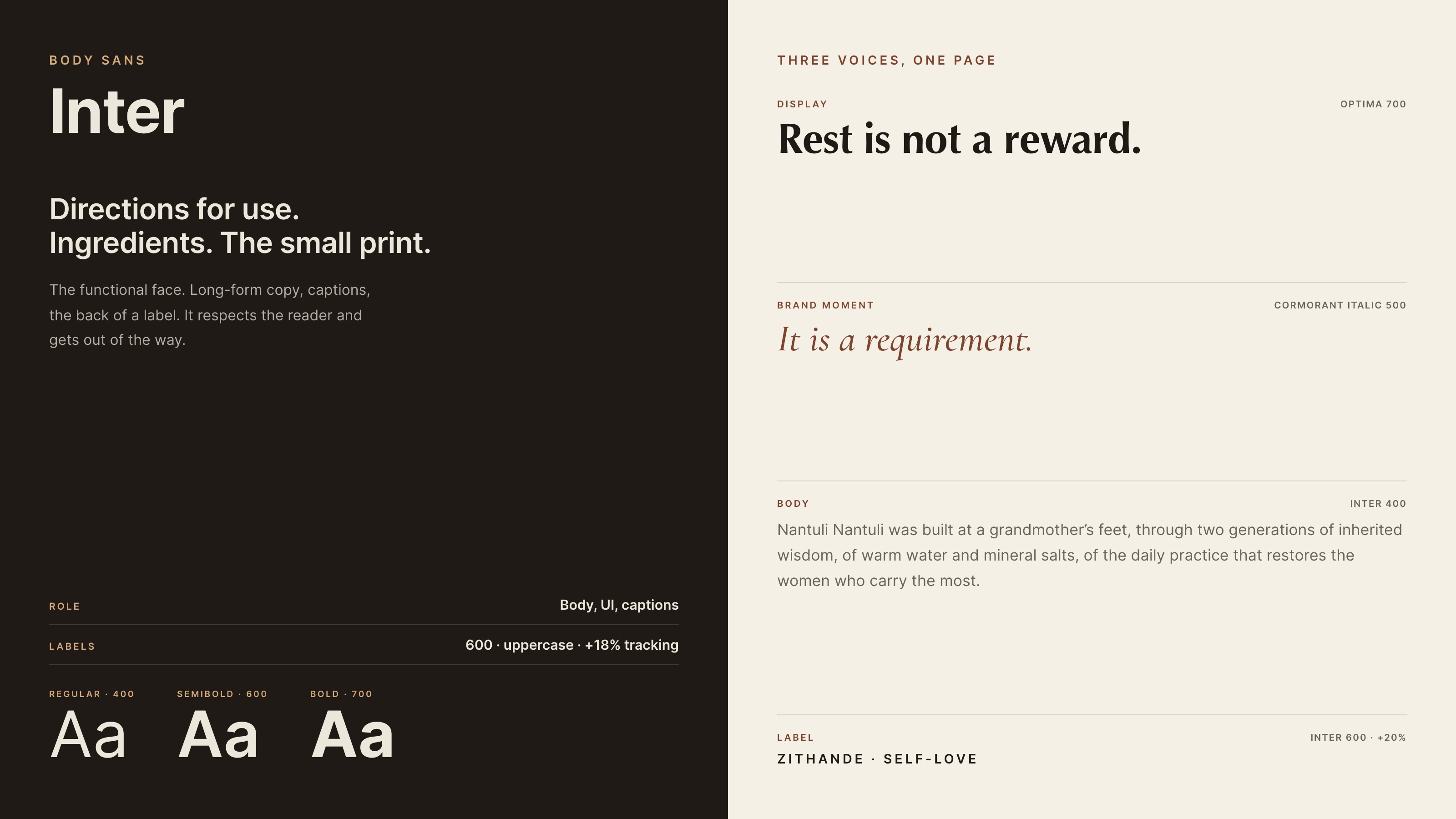
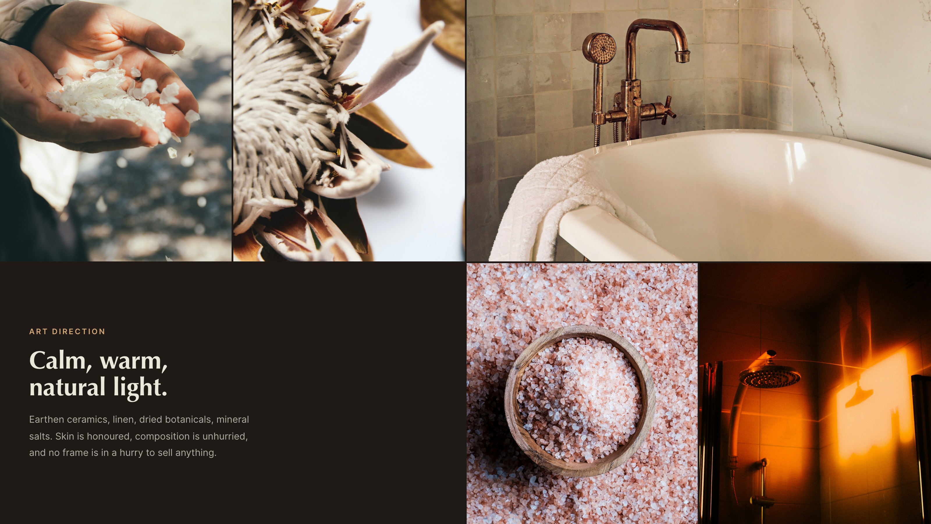
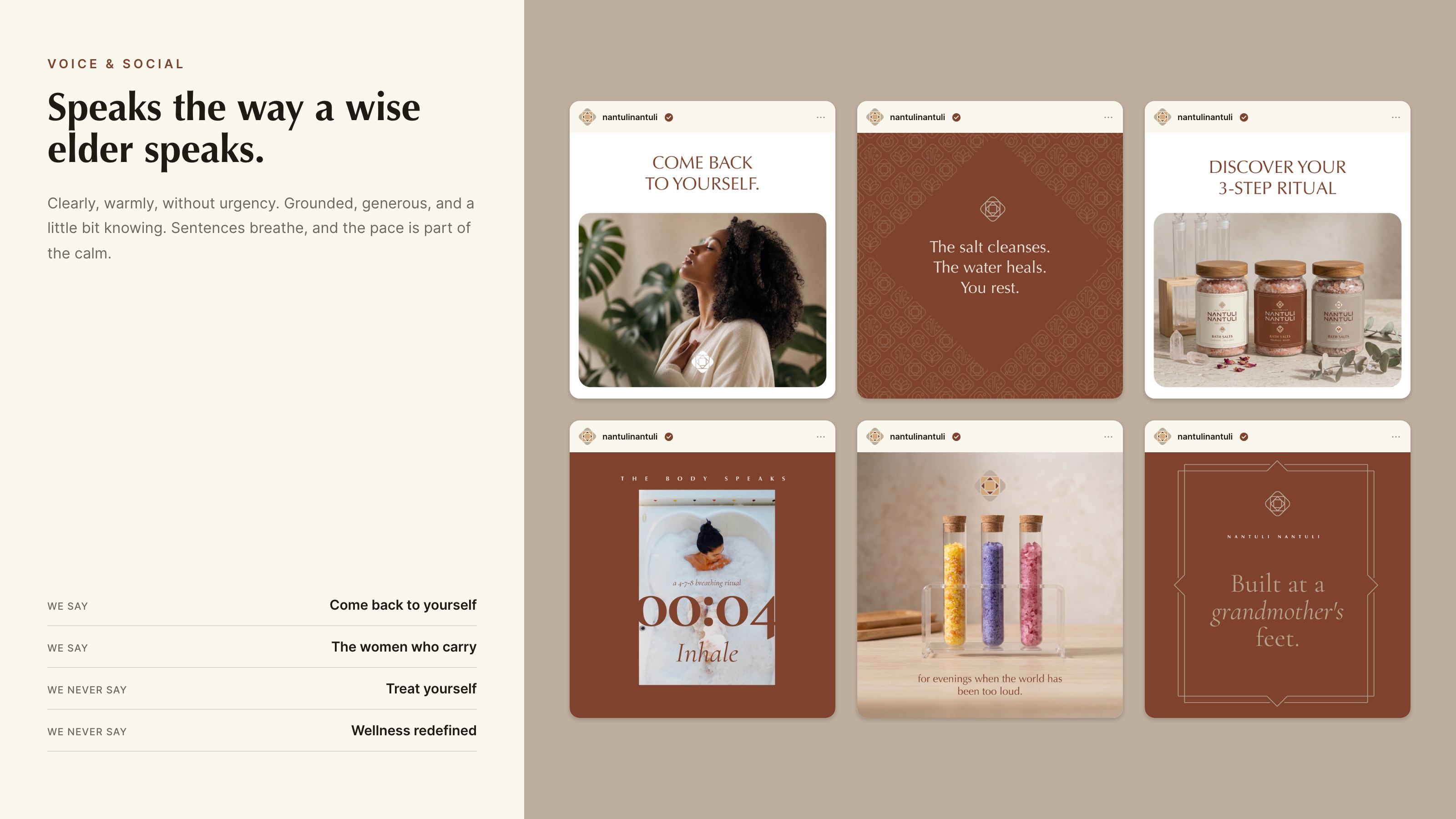
The palette is earth and no more than earth. Sienna leads, stone holds the space around it, camel warms where the eye lands, cream is the canvas, blush is reserved for softness. Three typefaces, each with one job: Optima for display, Cormorant Garamond in italic for the sentences that should be read at half pace, Inter for everything functional. Two seamless lattice patterns sit beneath the brand as surface, never as voice.
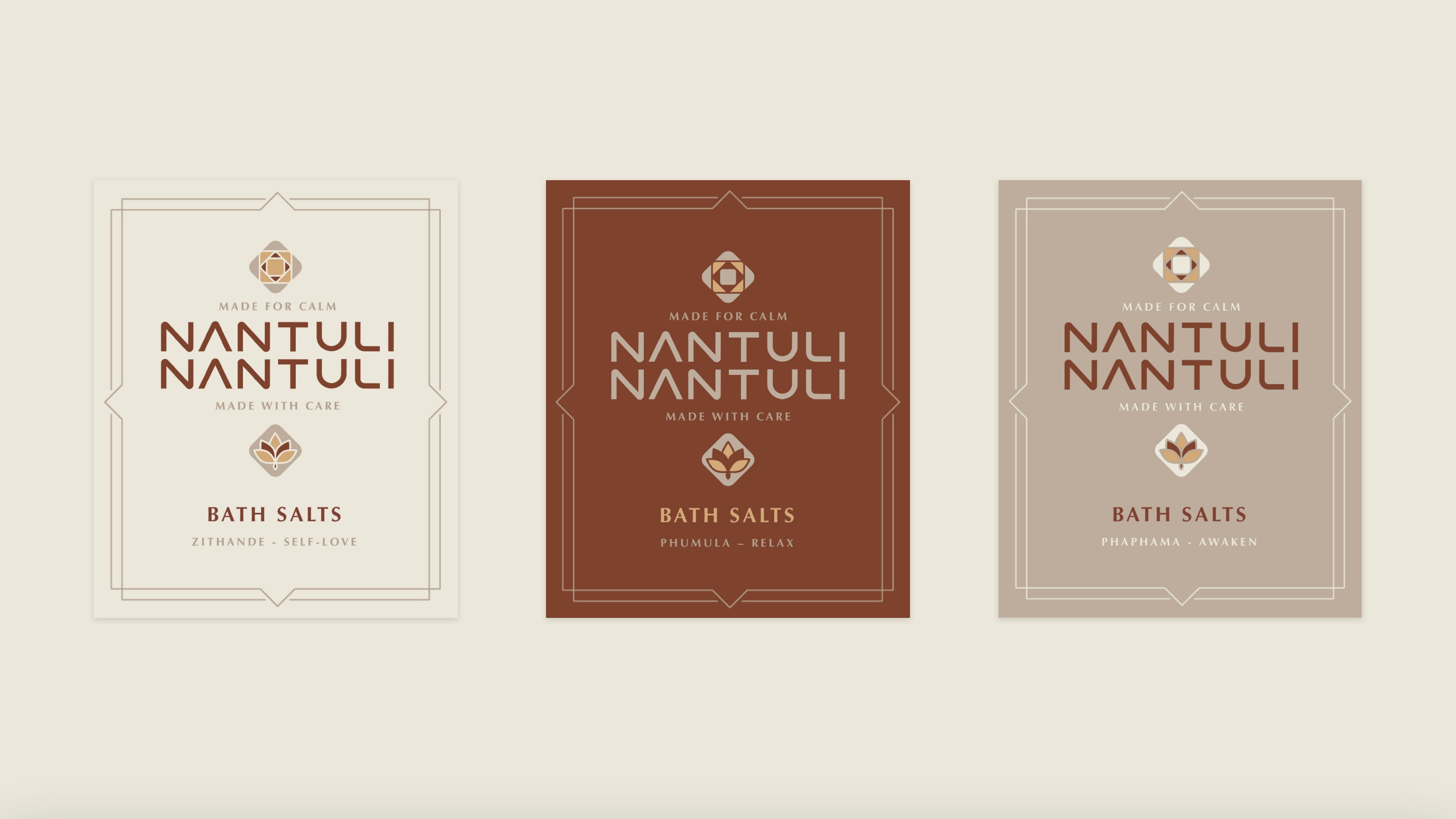
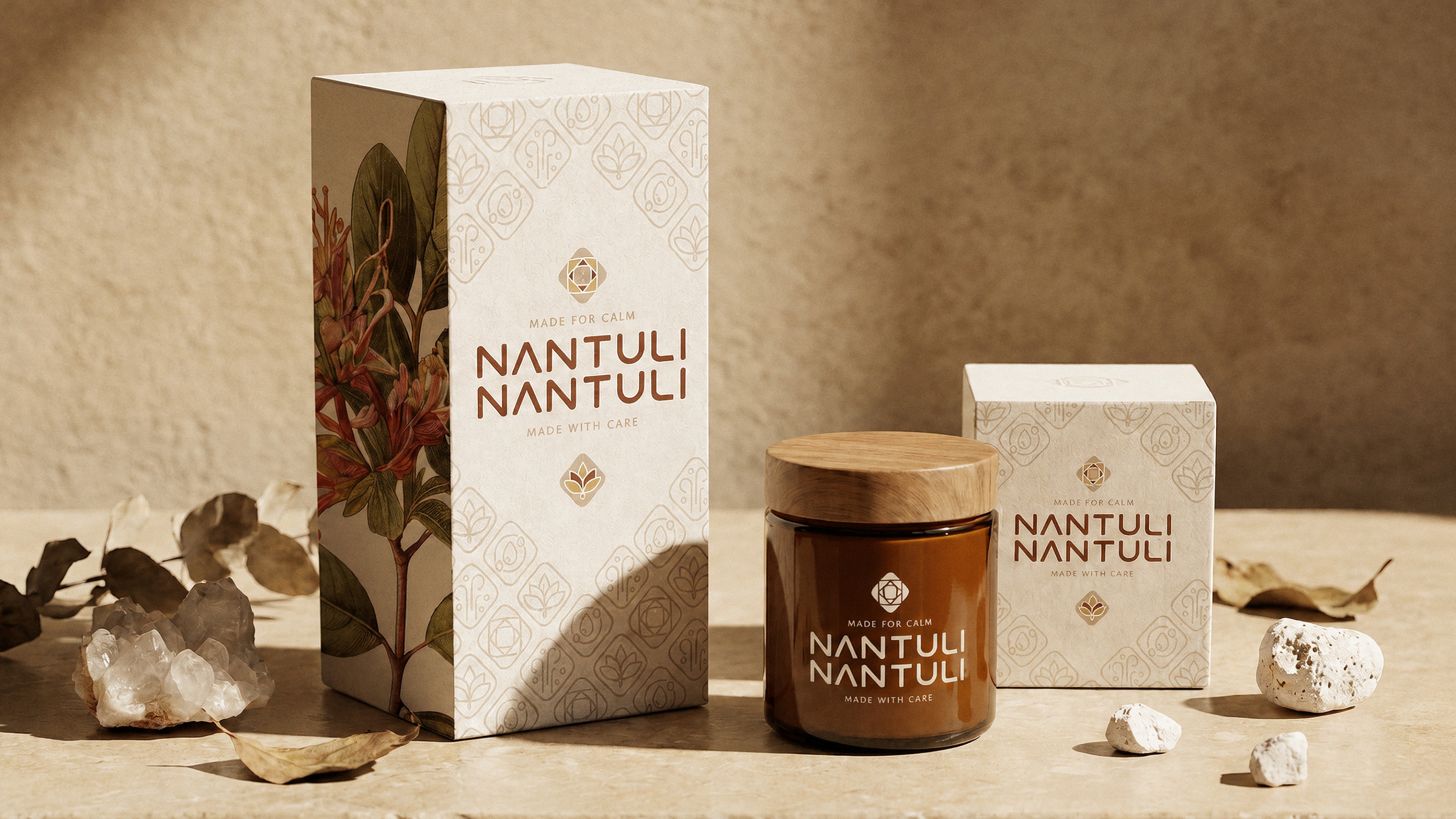
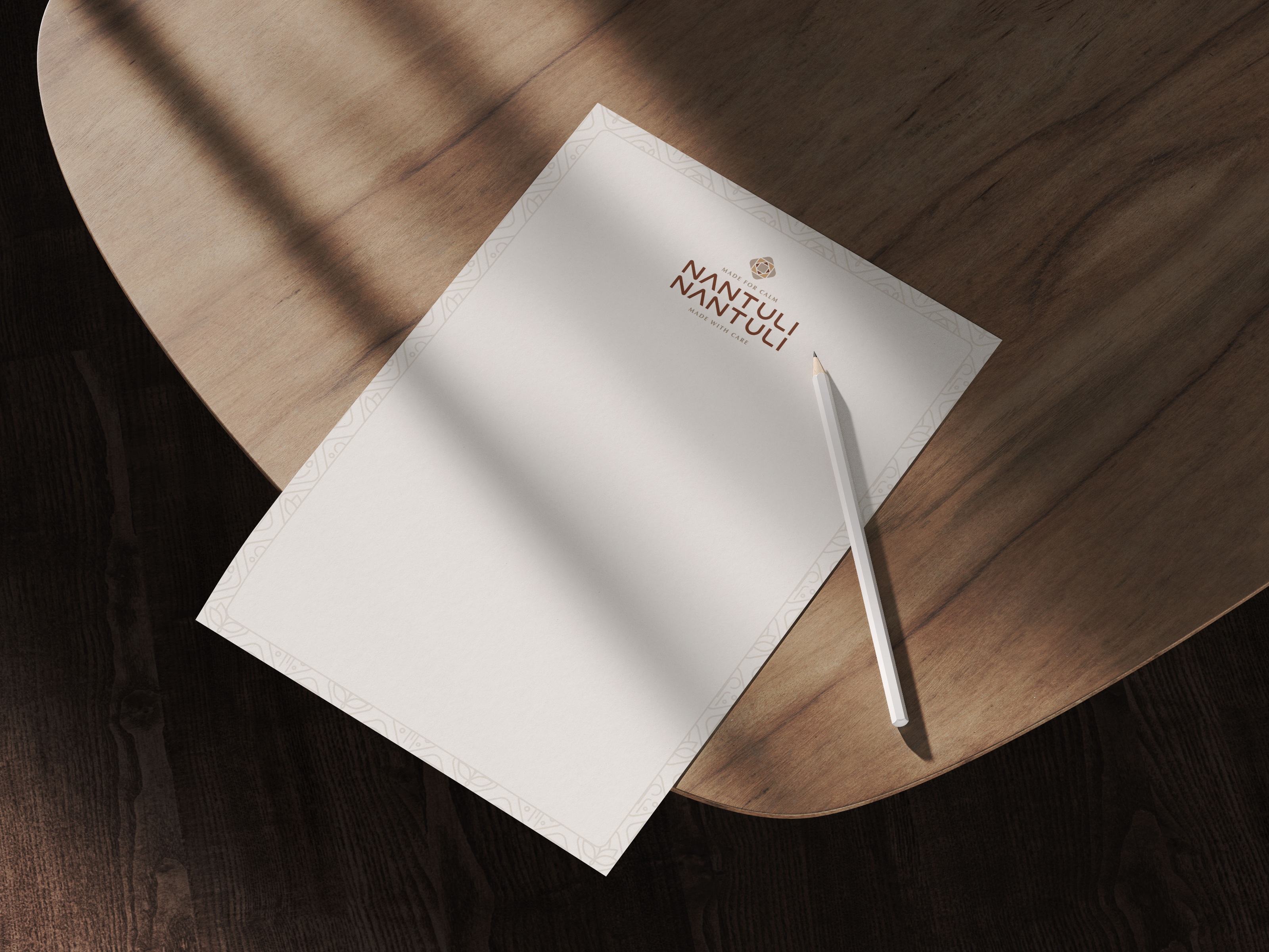
Then the system in use. Labels for Zithande, Phumula and Phaphama, built on one frame so only the colour and the isiZulu name change. Packaging, stationery, an email signature, an icon set, a social template system, and a brand guide that documents the measurements rather than describing the mood.

The results
Thuli can now brief a printer, a photographer or a retailer without being in the room for it. The blends can extend to a fourth and a fifth without anybody redesigning the frame, because the frame is documented and the rules are measured rather than remembered.
What is not built yet is the engine that runs on top: the content system and the launch campaign, which are the next two modules rather than a nice-to-have. The usual ending here is a logo, a guide and an invoice. This one ends with a founder who owns the language and knows which piece comes next.